Flexbox in CSS()


//Some notes on flex aug2020
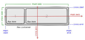
parent element, known as “flex container”
children (said “flex items”)
Generally for mobile views flex direction :column is used .
display:flex ---turns in container for flex items ie this element is parent for its flex childern
```.container { display: flex; / or inline-flex / }
> Flexbox is (aside from optional wrapping) a single-direction layout concept. Think of flex items as primarily laying out either in horizontal rows or vertical columns.


```.container {
  flex-direction: row | row-reverse | column | column-reverse;
}
align-items demonstration of differnet alignment options, like all boxes stuck to the top of a flex parent, the bottom, stretched out, or along a baseline
This defines the default behavior for how flex items are laid out along the cross axis on the current line. Think of it as the justify-content version for the cross-axis (perpendicular to the main-axis).
.container { align-items: stretch | flex-start | flex-end | center | baseline | first baseline | last baseline | start | end | self-start | self-end + ... safe | unsafe; } stretch (default): stretch to fill the container (still respect min-width/max-width) flex-start / start / self-start: items are placed at the start of the cross axis. The difference between these is subtle, and is about respecting the flex-direction rules or the writing-mode rules. flex-end / end / self-end: items are placed at the end of the cross axis. The difference again is subtle and is about respecting flex-direction rules vs. writing-mode rules. center: items are centered in the cross-axis baseline: items are aligned such as their baselines align The safe and unsafe modifier keywords can be used in conjunction with all the rest of these keywords (although note browser support), and deal with helping you prevent aligning elements such that the content becomes inaccessible.